DRIFTER
Overview
ROLE:
Graphic Design
Logo Design
Creative Direction
Merchandise Design
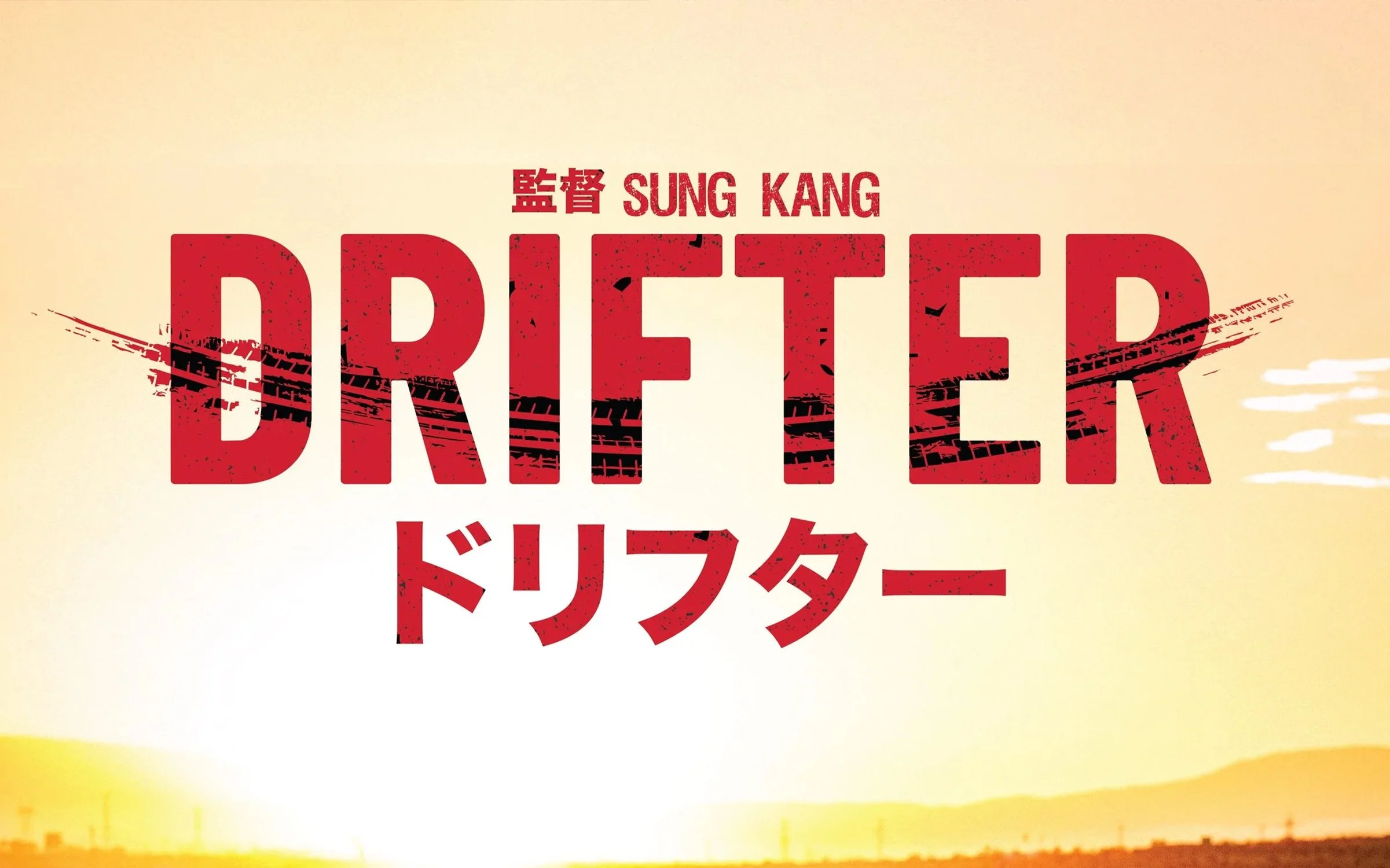
DRIFTER is an independent film directed by Sung Kang centered around automotive culture, filmmaking, and the people behind it. I was brought onto the project to develop the film’s visual identity, beginning with the DRIFTER wordmark and expanding the system into merchandise and supporting graphics.
The goal was to create an identity that felt rooted in automotive culture while remaining cinematic, recognizable, and flexible enough to live across film, apparel, and promotional applications.

IDENTITY
The DRIFTER identity was designed around movement, speed, and the imperfect character of drifting itself.
Rather than building a traditional automotive logo, I wanted the wordmark to feel cinematic and expressive—something that could represent the film while still feeling authentic when placed within car culture.
The resulting identity became the foundation for a broader visual system used across merchandise, promotional graphics, and the film’s public-facing presence.
EARLY EXplorations
Concept 1 (LOLA-AE86)
CONSIDERATIONS:
1. Character integration and nod to Lola (Car).
2. Typography is bold, gives movement.
3. ドリフター (Drifter) in katakana gives inspiration to anime influence.
4. Skid mark is reference to drift trail.
Concept 2 (Tires)
CONSIDERATIONS:
1. Tire mark shows drift maneuver.
2. D will act as a hero element, mimics the arc of a car swing or track curve.
3. Broken tire texture reflects drifting’s imperfection and the loner protagonist’s emotional tension.
4. Kinetic, textured, with trailing tire effects emphasizing speed.
Concept 3 (Sketch)
CONSIDERATIONS:
1. Lines trailing from letter D and word mimic speed lines in anime.
2. Brush type feels raw, reflecting the imperfect, lone protagonist.
3. Angled type and lines give it a feeling of acceleration and lift.
4. Isolated D works as emblem and can be flexible.
VISUAL REFERENCES
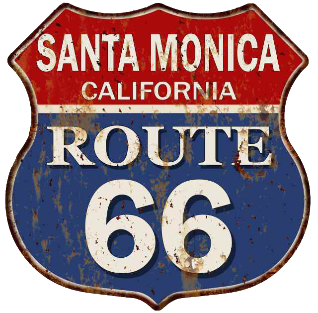
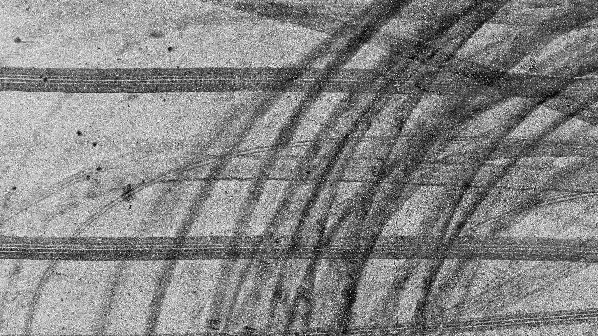
After the initial iterations, we refined the strongest details and introduced references tied to the film: the Route 66 sign in Santa Monica, where filming took place, and the Yokohama drift tire used on the car. These informed the wordmark’s letterforms and texture.
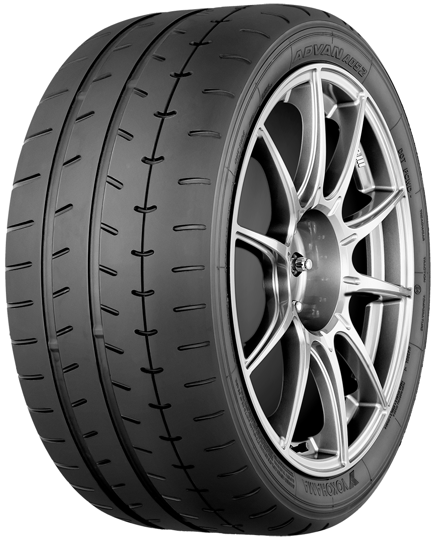
Final logo
TIRE & MOTION:
Tire pattern was adjusted to create a sense of directional movement using a brush swipe.
LEGIBILITY:
Letterforms were simplified so the mark remained recognizable at both film-title and apparel scales.
ROUTE 66:
Weathered sign details connect the identity to the film’s Santa Monica location.
Merchandise
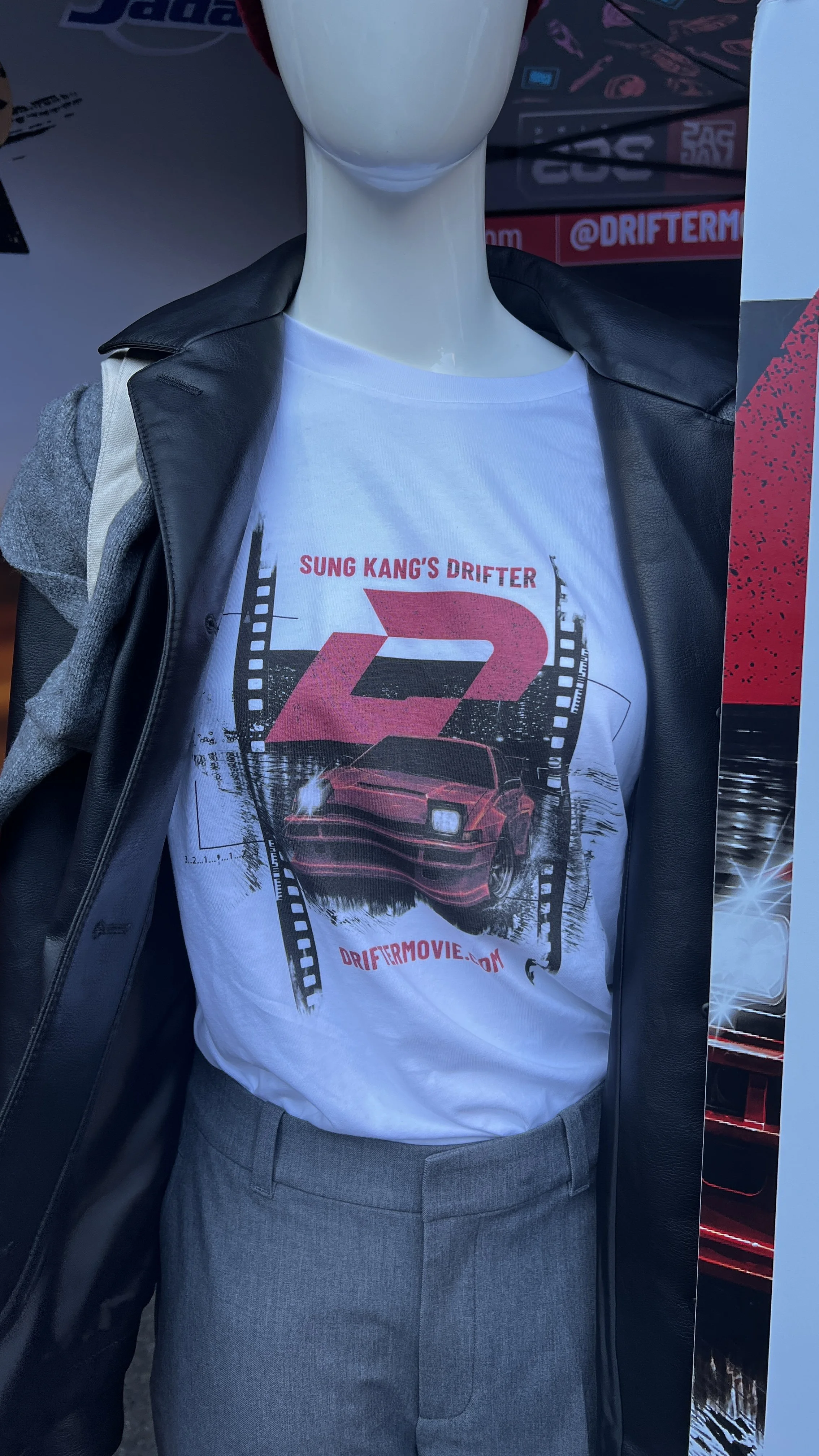
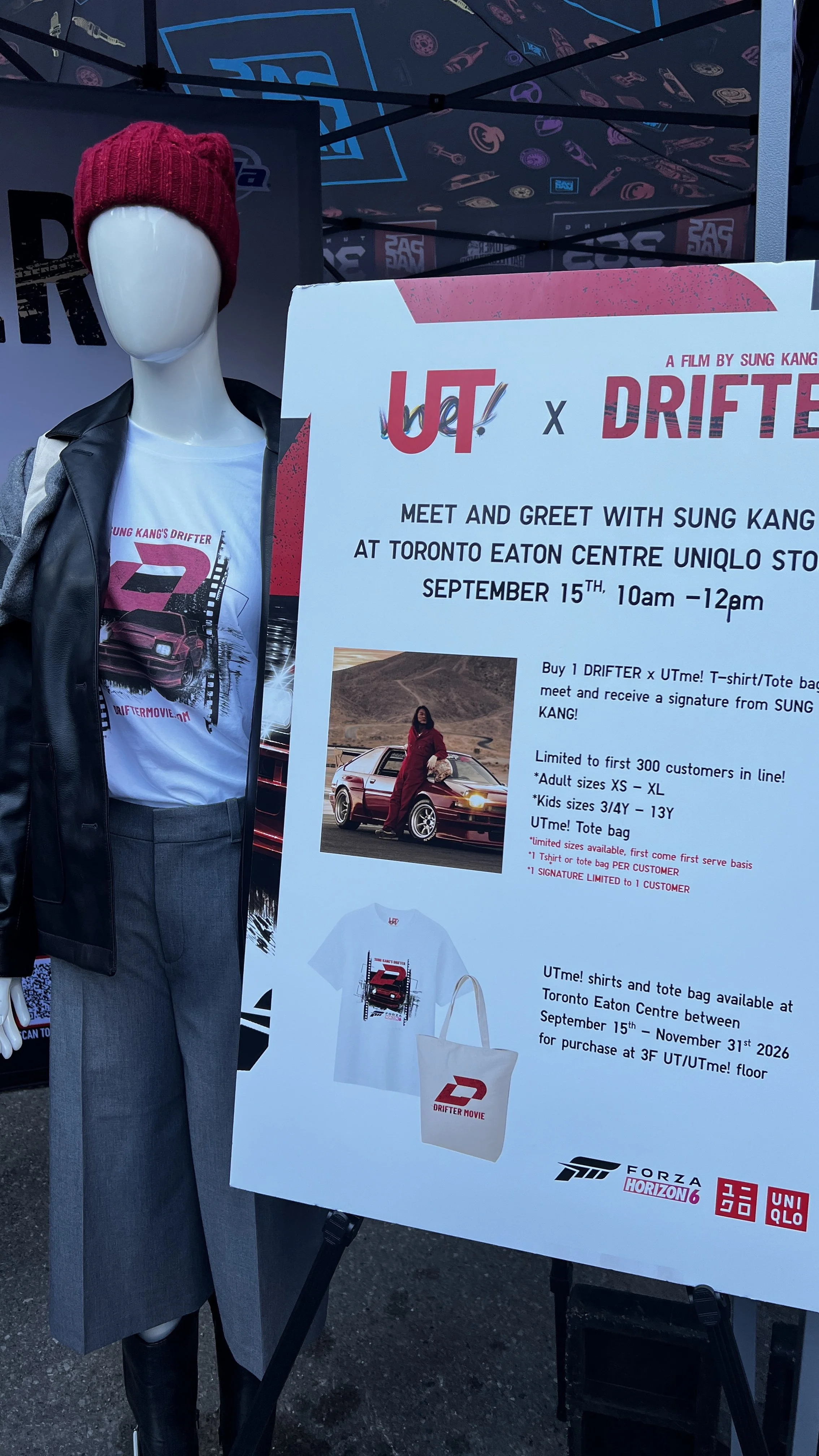
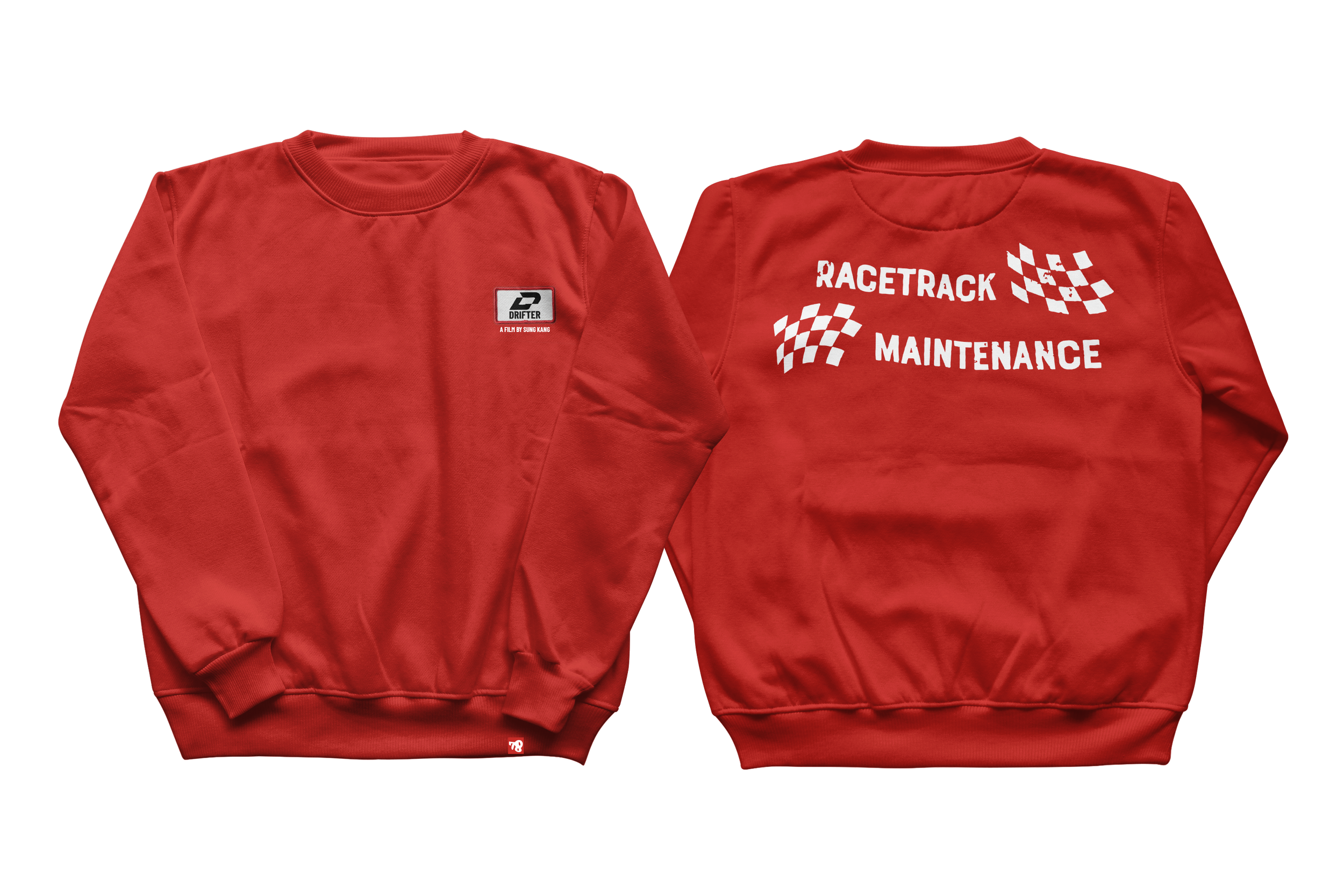
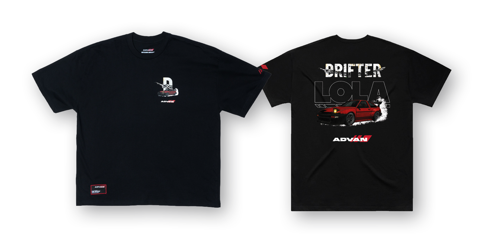
Drifter’s identity extends into wearable pieces for fans, from logo-led designs to expressive graphics inspired by the film’s cars and imagery. The wordmark anchors the collection, keeping each piece connected to the film.
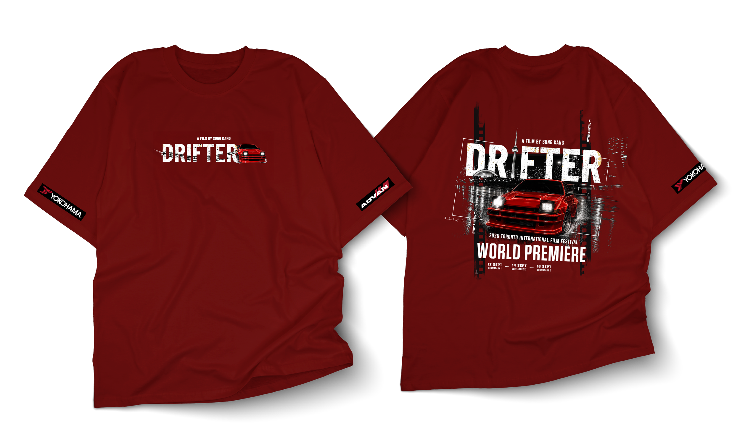
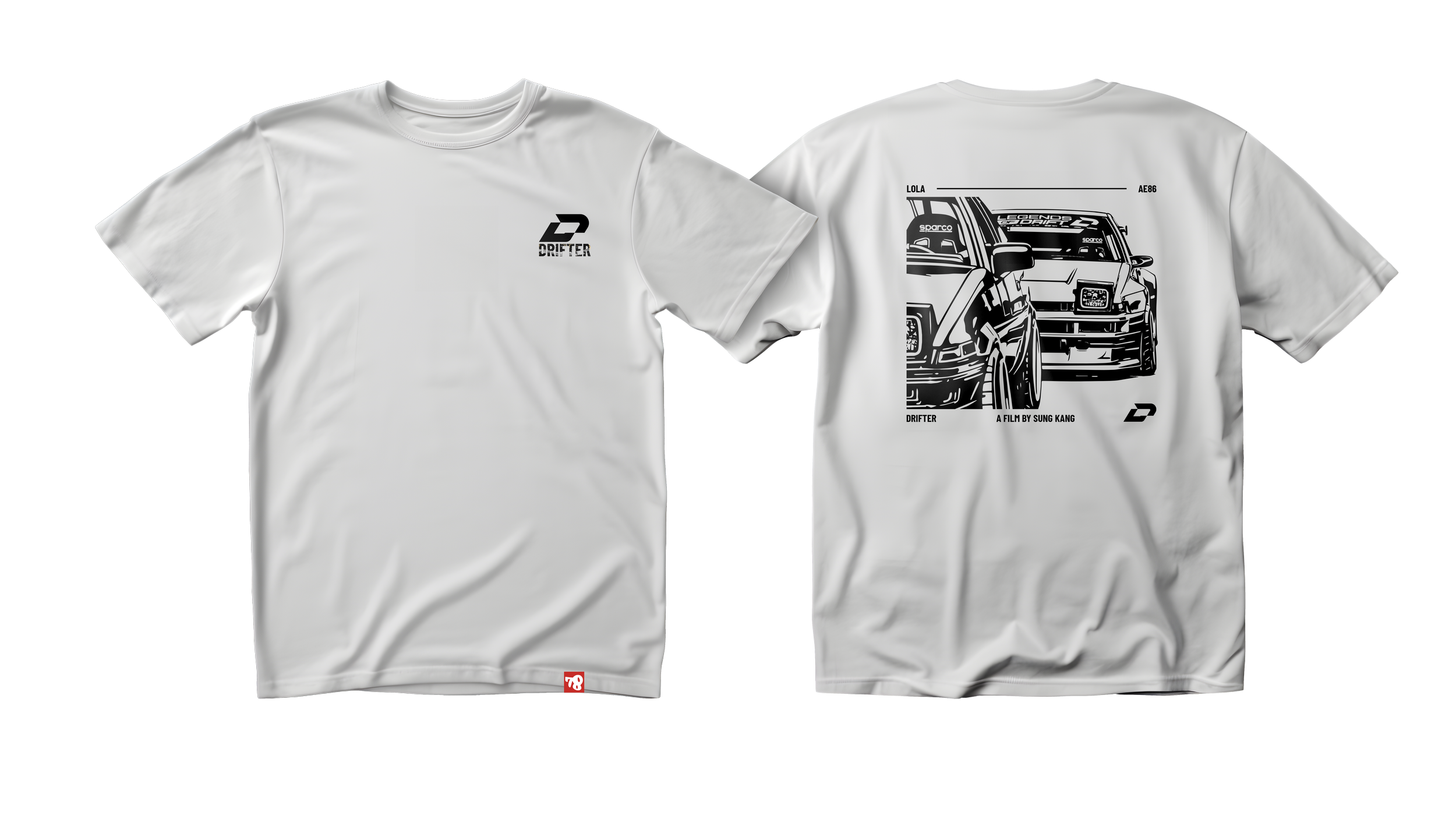
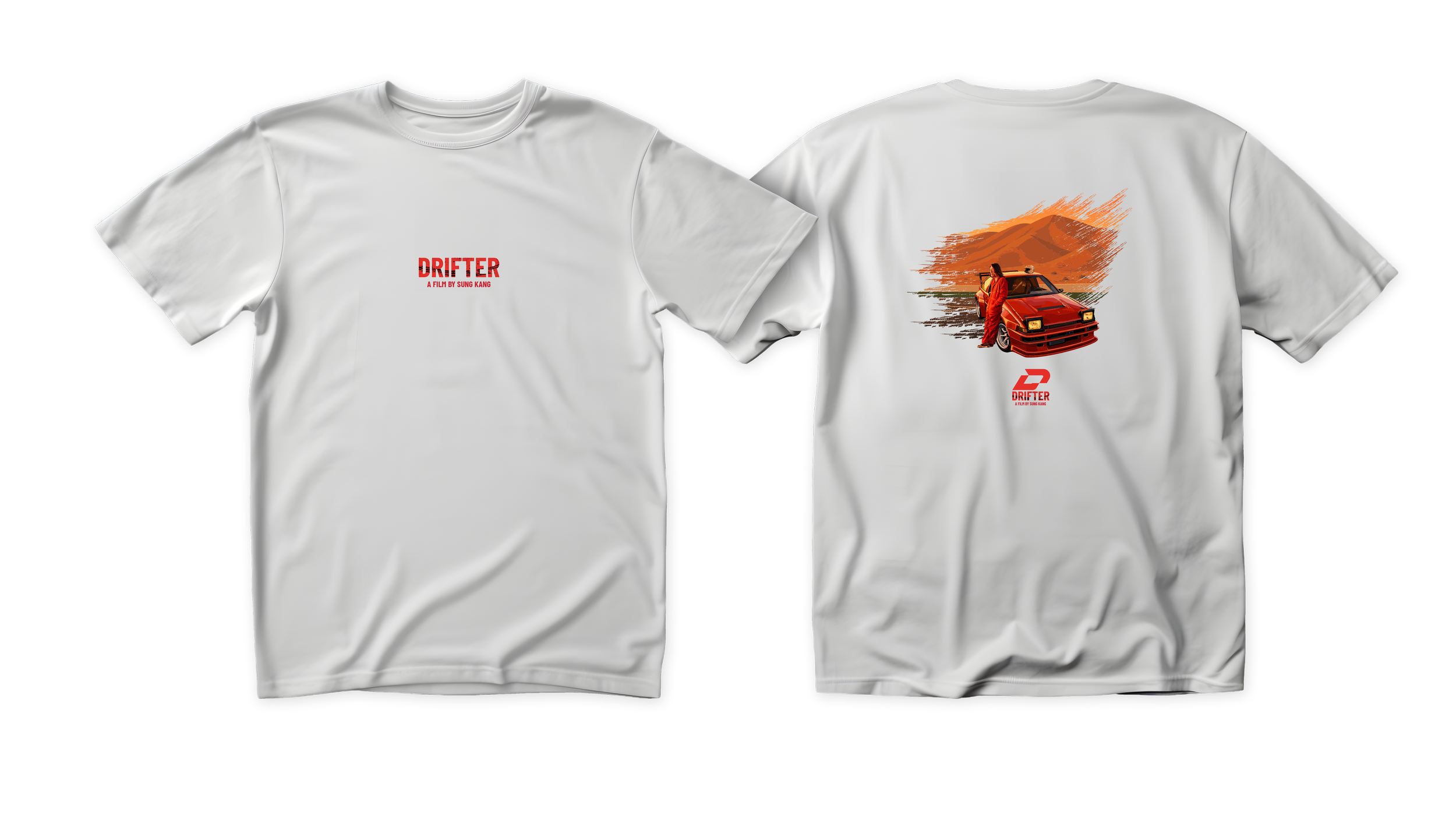
Visual System/Application
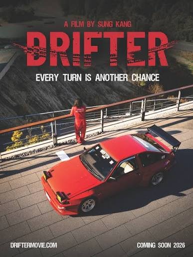
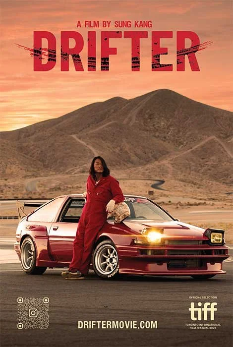
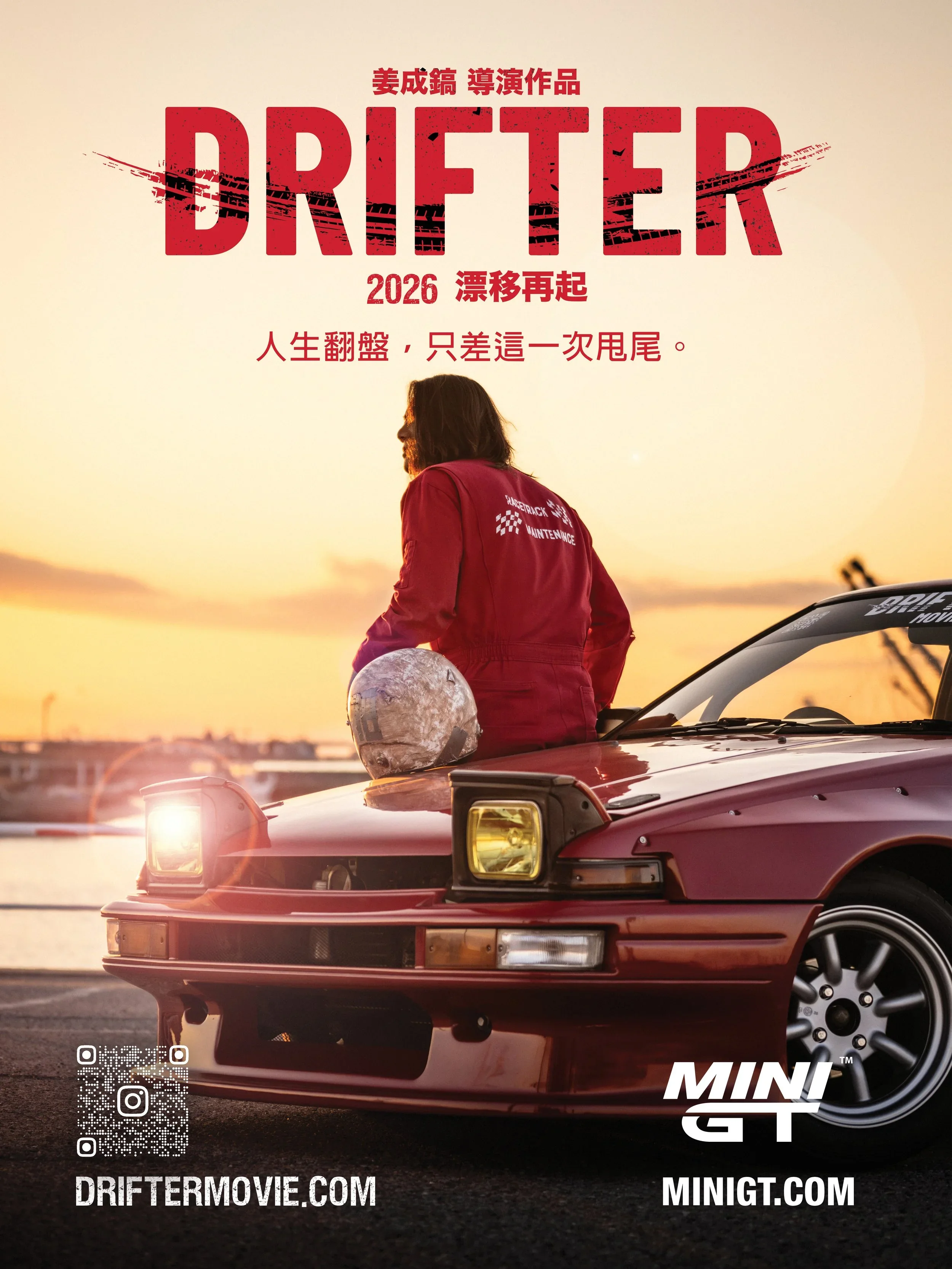
Drifter’s visual identity comes to life across posters, merchandise, collaboration with Uniqlo, and premiere events, including TIFF. The wordmark anchors each application, creating a recognizable presence wherever audiences encounter the film.